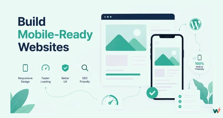
To make a website mobile friendly, add the viewport meta tag, switch to a responsive layout that reflows to one column on small screens, and serve images sized for phones in WebP. Then test the page in Lighthouse, because Google retired its Mobile-Friendly Test in December 2023. When we applied those three fixes to a desktop-only test page, its mobile Largest Contentful Paint fell from 60 seconds to 1.4 seconds.
If your site runs on WordPress, the delivery half of the job can sit with your host. On InstaWP’s managed WordPress hosting, every production plan includes a CDN and the Pro plan adds automatic WebP conversion, so this guide covers both the fixes you make in your theme and the ones your host can take off your plate.
- Phones now carry most web traffic: 58.99% worldwide in September 2026, per StatCounter. Since 5 July 2024 Google crawls with its smartphone crawler only, so content a phone cannot reach does not get indexed.
- Google’s Mobile-Friendly Test, its API and the Search Console Mobile Usability report were retired on 1 December 2023. Use Lighthouse or PageSpeed Insights now. Bing still runs its own Mobile Friendliness Test Tool.
- The viewport tag on its own can make a page score worse. In our test it fixed the text size but dropped the Lighthouse performance score from 75 to 58, because images without a width and height started shifting the layout (CLS 0.348).
- Images are usually the heaviest part of a page. Resized WebP images with srcset took our test page from 11.7 MB to 149 KB and its Largest Contentful Paint from 60.0 s to 1.4 s.
- Make every tap target at least 24 x 24 CSS pixels (the WCAG 2.2 AA minimum), and give menu links and main buttons 44 to 48 pixels.
- On InstaWP, the CDN starts on Starter ($5 a month per site), object cache on Plus ($9), and automatic WebP image optimization plus built-in staging on Pro ($15).
Table of Contents
What makes a website mobile friendly?
A mobile-friendly website fits a phone screen without sideways scrolling, has text you can read without zooming, has links and buttons big enough to tap, and loads quickly on a mobile connection. Google describes the same checks in its mobile site and mobile-first indexing guide. Miss one and visitors have to pinch and zoom to use the page.
This matters for search more than ever. Google finished its move to mobile-first indexing on 5 July 2024, and its announcement says that a site whose content is not accessible on a mobile device can no longer be indexed.
The speed thresholds are Google’s “good” Core Web Vitals values, measured at the 75th percentile of real visits.
How do you test if a website is mobile friendly in 2026?
Run Lighthouse in Chrome DevTools or on PageSpeed Insights, then open the page on a real phone. Google’s old Mobile-Friendly Test no longer exists: its address now redirects to the Lighthouse overview. Google retired it on 1 December 2023, together with its API and the Mobile Usability report in Search Console. Many guides still link to it; the table shows what replaced each piece.
To run the check yourself in Chrome:
- Open the page in Chrome and press F12 (or Cmd+Option+I on a Mac) to open DevTools.
- Open the Lighthouse tab, choose Navigation mode and the Mobile device.
- Click Analyze page load. Read the Performance score first, then the SEO and Accessibility audits for the viewport, font-size and tap-target results.
- Switch on device mode (the phone icon) and scroll the page at 390 px wide. Any sideways scroll is a layout bug.
Two more tools are worth having. BrowserStack runs the page on real iOS and Android devices in the cloud, and your own phone on a mobile connection is the closest you will get to what visitors see.
How to make a website mobile friendly: 9 steps
Work through these nine steps in order. Step 1 is for people starting a new WordPress site or moving hosts. If you are fixing a site you already have, start at Step 2.
- Start on a WordPress host with responsive defaults
- Add the viewport meta tag
- Use a responsive theme
- Make the layout fluid with responsive CSS
- Design with a page builder’s mobile controls
- Size text and tap targets for thumbs
- Shrink and modernize your images
- Speed up delivery with caching and a CDN
- Test on staging and real phones, then publish
Step 1: Start on a WordPress host with responsive defaults
The easiest way to start a mobile-friendly WordPress site is to build it on a platform where the speed and testing pieces are already in place, and on InstaWP that takes a few clicks. InstaWP is a managed WordPress hosting provider with one dashboard for building, staging and hosting WordPress sites. For mobile work, that gives you:
- New sites from scratch, from a saved snapshot, from the template store or with an AI builder, all starting from WordPress themes you can preview on a phone. See WordPress templates.
- A choice of WordPress version, PHP version (7.4 to 8.5) and server region, so you can host close to your visitors.
- InstaCDN edge caching on every production plan, and an object cache from the Plus plan.
- Automatic WebP conversion with the Image Optimizer, and a one-click staging copy, both from the Pro plan.
- SSH, SFTP, WP-CLI and an in-dashboard Code Editor on every plan, for theme edits such as the viewport tag.
How to create your first mobile-friendly site on InstaWP
1. Sign up and open Sites. Go to app.instawp.io and create an account. Adding a card gives you $25 in credits. Then click Add Site.
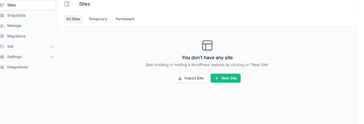
2. Pick how to build it. Choose From Scratch, a Snapshot, the Store or AI. For a full walkthrough, read the Create Site documentation or watch the video.
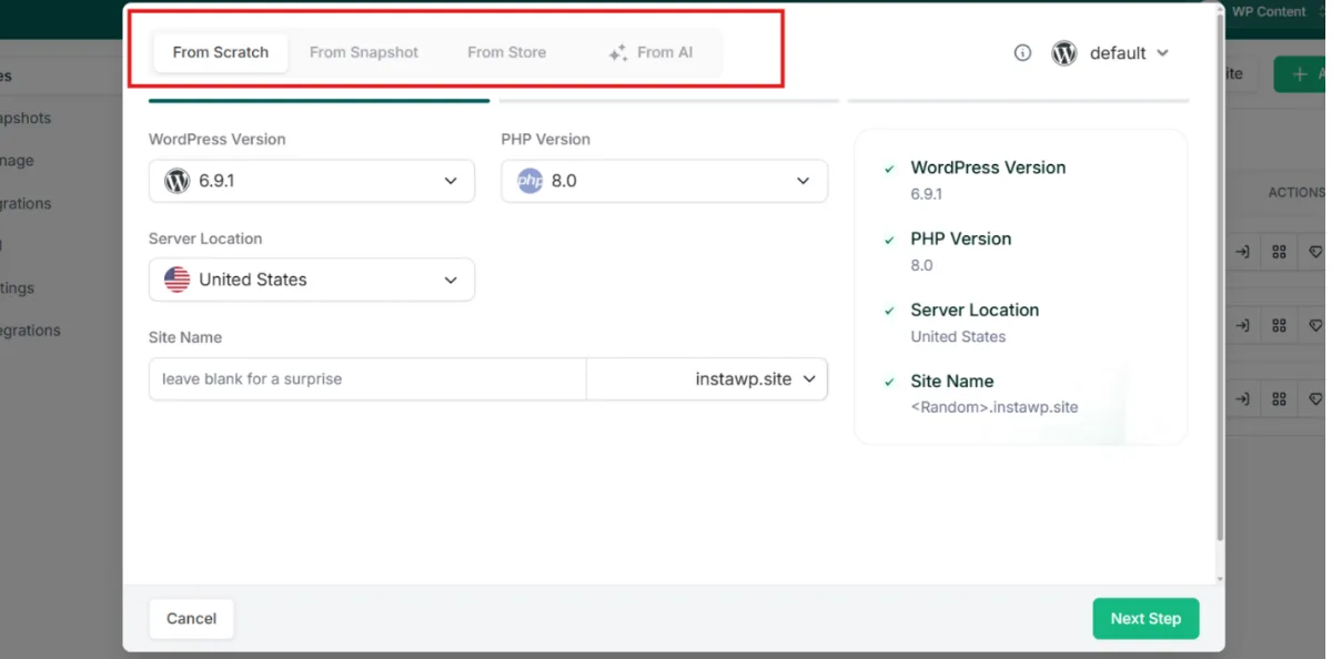
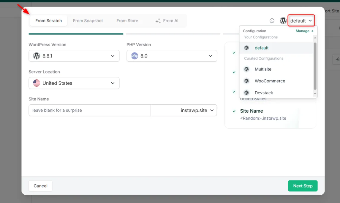
3. Configure the site. Choose the WordPress version, a current PHP version and the region closest to your audience. A nearby region shortens every request a phone makes.
4. Choose a plan. Plans are billed per site per day, so you can start small and change plan later. The Sandbox plan ($2 a month) suits building and testing; production plans start at Starter ($5).
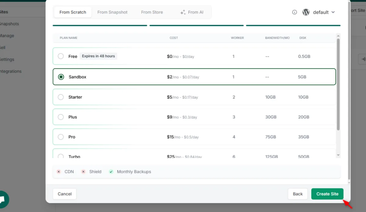
5. Create the site. Click Create Site. You get the site URL, the admin login and a Magic Login button that opens wp-admin without a password.
Already have a site on another host?
You do not need to move hosts to make a site mobile friendly, and Steps 2 to 9 work anywhere. Moving is worth it when your current host is the bottleneck: no CDN, slow server response, or no staging to test changes on. Migrations into InstaWP are free, and InstaWP’s team will move the site for you. See WordPress migrations.
Step 2: Add the viewport meta tag
The viewport meta tag tells a phone to lay the page out at the screen’s real width instead of pretending to be a 980 px desktop. Without it, a phone shrinks the whole desktop page to fit, which is why text looks microscopic. Add this one line inside the page’s <head>:
<meta name="viewport" content="width=device-width, initial-scale=1">
Almost every modern WordPress theme already includes it. To check, open the page in Chrome, right-click, choose View Page Source and search for “viewport”. If it is missing, add it to your theme’s header.php (in a child theme, so updates do not remove it) or with a plugin such as WPCode. On InstaWP, edit theme files through SFTP/SSH access or the in-dashboard Code Editor.
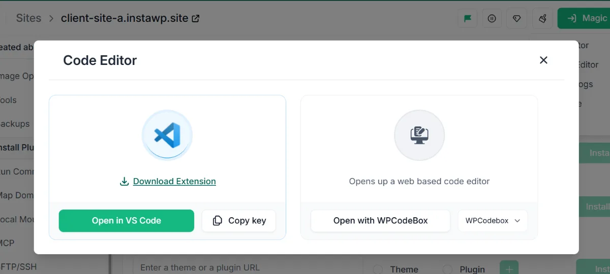
width and height attributes started pushing content down as they loaded (CLS 0.348). Also leave out maximum-scale=1 and user-scalable=no: they stop people zooming, which MDN flags as an accessibility problem.Step 3: Use a responsive theme
A responsive theme rearranges your content to fit any screen, from a 27-inch monitor to a phone, with no code from you. On WordPress, switching to one is the biggest single fix for an old, fixed-width site. Check the theme demo on your phone before you commit, and make sure it sets the viewport tag and stacks columns on small screens.
Popular responsive WordPress themes
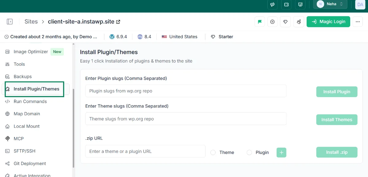
Browse more in the InstaWP theme store, or see our list of the fastest WordPress themes. To install one, go to Appearance > Themes > Add New in wp-admin. On InstaWP you can also install themes and plugins without logging in: open the site, choose Install Plugins/Themes, and enter the slugs or upload a .zip, several at once.
Step 4: Make the layout fluid with responsive CSS
Responsive CSS lets one layout adapt to every screen, using relative widths and media queries instead of fixed pixel widths. This is the step for a hand-coded site, or for fixing a theme that still overflows on phones. The core pattern is short:
/* 1. Never let anything be wider than the screen */
*, *::before, *::after { box-sizing: border-box; }
img, video { max-width: 100%; height: auto; }

/* 2. Fluid container instead of a fixed width */
.wrap { max-width: 1200px; margin: 0 auto; padding: 0 16px; }

/* 3. Three columns on desktop, one on phones */
.cols { display: grid; grid-template-columns: repeat(3, 1fr); gap: 30px; }
@media (max-width: 768px) {
  .cols { grid-template-columns: 1fr; }
}

/* 4. Readable text and thumb-sized links */
body { font-size: 16px; line-height: 1.6; }
nav a { display: inline-block; min-height: 48px; padding: 12px 10px; }
In our test this block alone removed the sideways scroll (the page went from 2,400 px wide to the phone’s 390 px), raised body text from 13 px to 16 px and took accessibility from 92 to 100. It did nothing for speed, because the images were still huge. That is Step 7.
Step 5: Design with a page builder’s mobile controls
If you would rather not touch code, a page builder shows you the phone layout while you design and lets you adjust each device separately. Use its mobile preview for every template, not just the home page.
Page builders with mobile preview
- Elementor: switch to Mobile in the responsive mode bar and change font size, padding and visibility for that device only.
- WPBakery: responsive options on each element and column.
- Gutenberg (the block editor): preview Desktop, Tablet and Mobile from the editor toolbar; the Columns block has a “Stack on mobile” setting.
- Brizy: drag-and-drop with separate tablet and mobile editing modes.
InstaWP also has two AI site builders that produce responsive WordPress sites: describe the business and get a full site to refine. Follow the ZipWP AI guide or the Kadence AI guide, and see AI features.
Step 6: Size text and tap targets for thumbs
Use 16 px body text and make every link and button easy to hit with a thumb. The accessibility minimum is a target of 24 x 24 CSS pixels (WCAG 2.2, criterion 2.5.8). For menu links and main buttons, aim for the 44 pt Apple and 48 dp Android guidance. In our test, the desktop-only menu links were 13 px tall; the responsive CSS above made them 49.6 px. Lighthouse’s target-size audit passed both versions because the small links were spaced apart, so measure your main buttons yourself.
Step 7: Shrink and modernize your images
Images are the usual reason a mobile page is slow. Serve each image at the size the screen needs, in a modern format, and tell the browser its dimensions. On our test page this one step took the weight from 11.7 MB to 149 KB and the Largest Contentful Paint from 60.0 s to 1.4 s, and the Lighthouse score from 75 to 100.
Image optimization checklist
- Use WebP (or AVIF): both are much smaller than JPEG or PNG at the same visible quality.
- Resize before upload: do not upload a 4,000 px photo for an 800 px slot.
- Serve responsive sizes:
srcsetandsizeslet a phone download the small version. WordPress addssrcsetautomatically for images inserted from the media library. See web.dev on responsive images. - Always set width and height: this reserves the space and prevents layout shift.
- Lazy-load below the fold only: WordPress lazy-loads images by default (since 5.5), but the main hero image should load first, not lazily.
<img src="hero-1200.webp"
     srcset="hero-600.webp 600w, hero-1200.webp 1200w"
     sizes="(max-width: 768px) 100vw, 1168px"
     width="1200" height="675"
     fetchpriority="high"
     alt="Fresh loaves on a bakery counter">
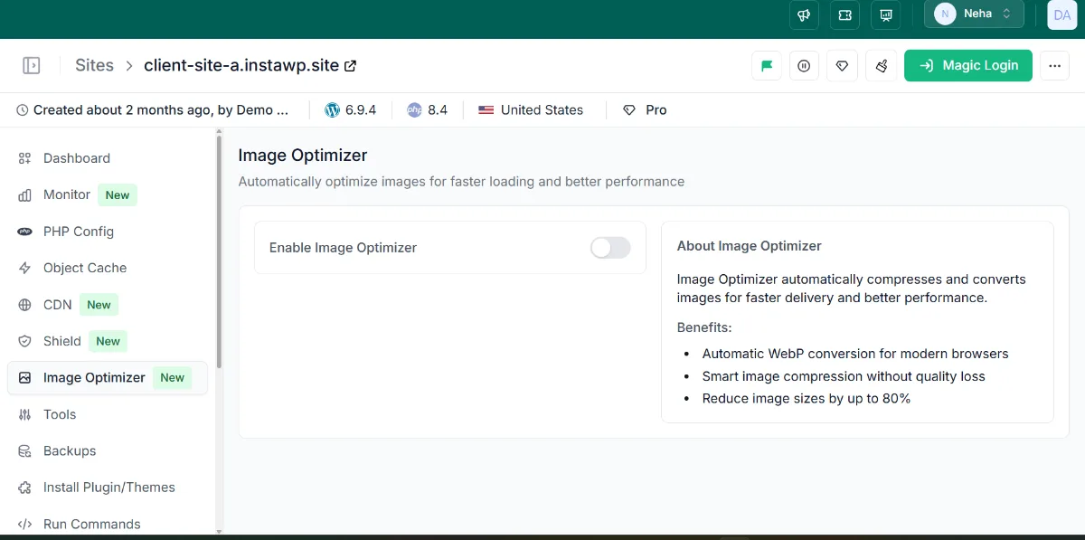
On InstaWP, the Image Optimizer does the conversion for you on Pro plans and above: switch it on and it compresses images and converts them to WebP, with no plugin to install. See how InstaOptimize works.
Step 8: Speed up delivery with caching and a CDN
Caching and a CDN cut the time a phone waits for the server and for files to travel. A CDN serves your pages and files from an edge location near the visitor, and an object cache keeps database results in memory so WordPress answers faster, which helps most on dynamic, logged-in and cart pages.
How InstaWP handles delivery
Read more in the InstaCDN explainer. On any other host, the equivalent is a page-caching plugin, an object cache such as Redis or Valkey if your host offers one, and a CDN in front of the site.
Step 9: Test on staging and real phones, then publish
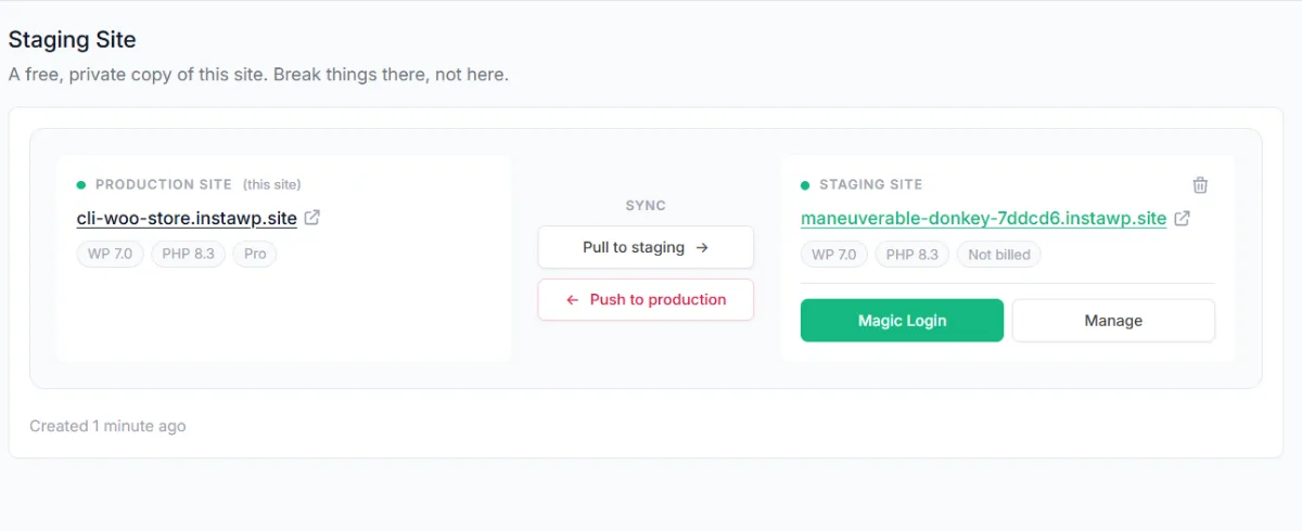
Make mobile changes on a staging copy, test them, then push them live. A theme switch or new CSS can break a layout you did not check, and staging keeps that off your live site. Take a snapshot first so you can roll back.
On InstaWP, built-in staging (Pro plan and above) creates a private copy of the live site. Run Lighthouse and check it on your phone there, then use Push to production, or 2-Way Sync for sites managed through InstaWP Connect. More on the workflow in WordPress staging environments.
What does each mobile fix actually change? We tested it
Each fix solves a different problem, and the order matters. To show it, InstaWP built a deliberately desktop-only test page and applied the fixes one at a time, measuring each version with Lighthouse on a simulated phone. Only the image step moved load time; the viewport tag alone made the score worse.
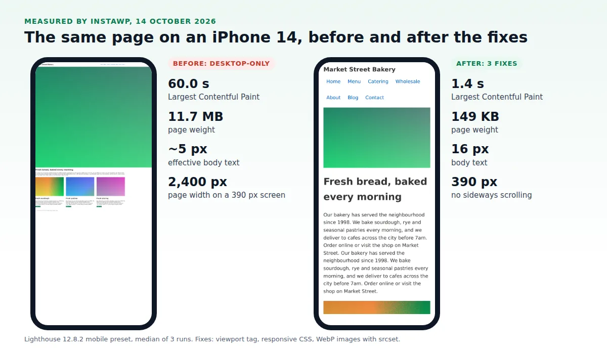
Three results stand out:
- The viewport tag fixes readability, not speed. It made the text legible (Lighthouse’s font-size audit went from fail to pass) but the page scored lower until the images had dimensions.
- Responsive CSS fixes layout, not speed. Version C removed the sideways scroll and scored 100 for accessibility, yet still took a minute to load.
- Images decide speed. Version D cut the weight by 98.7% and was the only version with a “good” Largest Contentful Paint (2.5 s or less).
Method: one HTML page with a 6.2 MB PNG hero and three 1.8 MB PNG images, served locally and measured on 14 October 2026 with Lighthouse 12.8.2 (mobile preset, simulated slow 4G), median of three runs. Text size and page width were measured in Chrome emulating an iPhone 14. LCP of 60.0 s is Lighthouse’s simulated figure for an 11.7 MB page on that connection.
How do you make a WordPress site mobile friendly?
On WordPress, most of the work is choosing a responsive theme and keeping images and plugins in check, because WordPress already adds srcset, image dimensions and lazy loading to images you insert from the media library. Work through this list:
- Confirm the theme is responsive. Preview it on Mobile in the Customizer or Site Editor, and check View Source for the viewport tag.
- Check each template, not just the home page. Blog posts, product pages, forms and the footer often break first.
- Fix columns and spacing in the editor. Turn on “Stack on mobile” for Columns blocks and reduce large padding for the mobile view.
- Replace oversized media. Images pasted from outside the media library miss
srcset; re-insert them from the library. - Audit heavy plugins. Sliders, pop-ups and chat widgets are common causes of slow, jumpy mobile pages. Remove what you do not need.
- Make navigation thumb-friendly. A mobile menu plugin such as Mobile Bottom Menu for WP puts key links within reach.
Need a native app rather than a responsive site? That is a different job; see how to convert a website to a mobile app and the best plugins to turn a WordPress site into an app.
What are the mobile-friendly design best practices?
Good mobile design keeps one column, large text and big targets, and never makes the visitor zoom or scroll sideways. These choices matter even on a good theme and a fast host.
How do you keep a website mobile friendly over time?
Re-test after every theme or plugin update and watch real-user data, because a site that passes today can slow down after a single update. Check the Core Web Vitals report in Search Console monthly, and Bing Webmaster Tools if Bing sends you traffic.
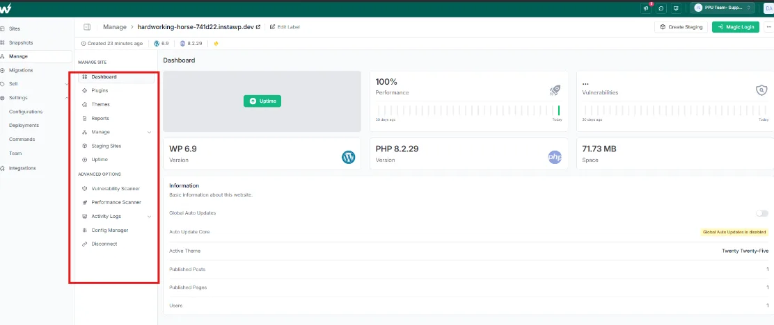
On InstaWP, the Manage dashboard tracks this for every connected site, including sites hosted elsewhere through the InstaWP Connect plugin. See WordPress site management:
- Uptime and performance monitoring: know when a site goes down. More in InstaMonitor.
- Performance Scanner: run performance scans across all your sites from one screen.
- PDF reports: share client-ready performance reports.
- Alert rules: choose who gets notified, and when.
Can you host a mobile-friendly WordPress site on InstaWP?
Yes. InstaWP is a managed WordPress hosting provider, and a site you build or test there goes live by changing its plan from Sandbox to a production plan, with the same URL and data and no migration. Each site runs isolated with its own reserved vCPU, and is billed per site per day.
On new-generation servers an InstaWP site scored 9.8 out of 10 in the WP Benchmark plugin, against 7.3 on older hardware (August 2026); the method is in the WordPress hosting benchmark. Security is covered by InstaShield and backups by managed backups. Compare plans on the pricing page.
Which way to make a website mobile friendly should you choose?
Pick the route that matches your starting point. A new WordPress site needs a responsive theme on a fast host; an old fixed-width site needs a new theme or responsive CSS; almost every site gains most from fixing its images.
What is the easiest way to make a website mobile friendly?
The easiest way to make a website mobile friendly is to use a responsive theme with the viewport tag, set image dimensions, serve WebP images sized for phones, and test the result in Lighthouse and on a real phone. If you are on WordPress, putting the site on a host that handles the CDN, caching and image conversion leaves you only the theme and content to get right.
Viewport tag plus image dimensions, a responsive theme or CSS, WebP images with srcset, a CDN, then test on staging and a real phone. In our test, that took a desktop-only page from a 60-second to a 1.4-second load on a phone.
Questions about mobile optimization on InstaWP? Leave a comment below or read the InstaWP documentation.
Frequently asked questions
How do I make my website mobile friendly?
Add the viewport meta tag, use a responsive theme or responsive CSS so the layout becomes one column on phones, set 16 px body text and large tap targets, and serve resized WebP images with width and height set. Then test the page in Lighthouse or PageSpeed Insights and on a real phone.
Is the Google Mobile-Friendly Test still available?
No. Google retired the Mobile-Friendly Test, its API and the Search Console Mobile Usability report on 1 December 2023. Use Lighthouse in Chrome DevTools or PageSpeed Insights instead, and the Core Web Vitals report in Search Console. Bing still offers its Mobile Friendliness Test Tool in Bing Webmaster Tools.
How long does it take to make a website mobile friendly?
A new WordPress site built on a responsive theme is mobile friendly from the start. Fixing an existing site takes an afternoon if a theme switch and image clean-up are enough, and days to weeks if a hand-coded layout has to be rebuilt with responsive CSS.
Why did my Lighthouse score drop after I added the viewport tag?
Usually because images on the page have no width and height. With the viewport tag, images are scaled to the phone screen and push content down as they load, which raises Cumulative Layout Shift. In InstaWP’s test, the score fell from 75 to 58 for exactly this reason and recovered once dimensions and resized images were added.
Is responsive design the same as mobile friendly?
Not exactly. Responsive design is one way to be mobile friendly: a single layout that adapts to the screen. Others are adaptive design and a separate mobile site. Responsive design is the most common approach and the one Google recommends.
Does mobile friendliness affect SEO?
Yes. Since 5 July 2024 Google crawls and indexes sites with its smartphone crawler, so the mobile version of a page is the version Google ranks, and content that cannot be reached on a phone is not indexed. Mobile speed also feeds into Core Web Vitals.
Can I make my existing WordPress site mobile friendly without rebuilding it?
Yes. Switch to a responsive theme, check the viewport tag, set image dimensions, optimize images and add caching and a CDN. Test each change on a staging copy first. On InstaWP, staging and automatic WebP conversion are included from the Pro plan.
Can I host my mobile-friendly WordPress site on InstaWP, and what does it cost?
Yes. InstaWP is a managed WordPress hosting provider with no free plan; adding a card gives you $25 in credits. Sandbox costs $2 a month per site for building and testing, and production plans start at $5 (Starter) with a CDN, $9 (Plus) with object cache, and $15 (Pro) with image optimization and staging. See the site plans comparison.