The best WordPress featured image size is 1200 × 630 pixels (a 1.91:1 ratio, effectively the same shape as the popular 1200 × 628), and from every upload WordPress automatically creates a 150 × 150 cropped thumbnail, a medium copy up to 300 × 300, a 768-pixel-wide medium-large copy and a large copy up to 1024 × 1024.
That size fills a blog header, matches the shape Facebook and most link previews use, and clears the 1,200-pixel width Google Discover asks for. What actually shows on the page is decided by your theme, which picks one of those copies (or a size of its own) and crops it.
So this guide gives you the size to upload by use, the exact size 11 popular themes request (we read each theme’s source code on 12 October 2026), and the three ways to change it. If you want to see the crop before you touch a client’s live site, a throwaway site on InstaWP’s managed WordPress hosting is the quickest place to test a theme.
- Upload 1200 × 630 px for blog posts. It works for headers, social shares and Google Discover, and stays a manageable file size as WebP or JPEG.
- WordPress makes up to six copies of every upload: 150 × 150 (cropped), 300, 768, 1024, 1536 and 2048 pixels. Copies bigger than your original are skipped, so a 1200 × 630 upload produces only four.
- Anything over 2560 px is scaled down automatically to a “-scaled” copy, which becomes the full size your theme loads.
- Most popular themes load the full image on single posts (GeneratePress, Kadence, OceanWP, Blocksy, Twenty Twenty-Five), so an oversized upload is the usual reason a featured image is “too big”.
- Changing a size never resizes old images. After Settings → Media or
add_image_size(), run Regenerate Thumbnails orwp media regenerate.
Table of Contents
What is a WordPress featured image?
A WordPress featured image is the single image you assign to a post or page to represent it. Your theme shows it at the top of the post, on blog and archive pages, and in related-post blocks, and SEO plugins such as Rank Math and Yoast use it as the social sharing image (the Open Graph image) unless you set a different one.
WordPress itself calls it a post thumbnail. A theme turns the feature on with add_theme_support( 'post-thumbnails' ) and can register its own display size, which is why the same upload looks different from one theme to the next (see the Theme Handbook on featured images).
Why does the featured image size matter?
Size affects three things you can measure. A file that is too large slows the page, and the featured image is often the Largest Contentful Paint element, the main loading metric in Core Web Vitals. One that is too small looks soft on retina screens and fails the 1,200-pixel width that Google Discover needs for large previews. And the wrong shape gets cropped, so heads, logos and title text get cut off. So image size is a WordPress performance decision as much as a design one.
What size should a WordPress featured image be?
Upload featured images at 1200 × 630 pixels for standard blog posts. It is wide enough for Discover and for most content columns on high-density screens, and it is the shape Facebook and most link previews show without cropping. Use a different size only when your layout or channel needs a different shape, as in the table below.
Recommended featured image sizes by use
Sources: Meta’s image guidelines for sharing, Google’s Discover and Article structured data documentation, and the WooCommerce image sizes docs. If you need 1200 × 628 to match an existing template, use it; at this size the two are visually identical.
Keep the important part in the middle. Themes, social networks and Discover all crop to different shapes. Leave roughly 10% padding on every side and keep text and faces centred, so the same file survives a 3:2, 16:9 or 1:1 crop.
What image sizes does WordPress create by default?
WordPress creates up to six resized copies of every image you upload, plus the original. The thumbnail is the only one cropped to an exact shape; the others are scaled to fit inside a maximum box, so they keep your image’s proportions. These are the defaults in WordPress 7.1.3, read from core’s source code:
WordPress skips any size larger than the original, so the size you upload decides how many files you get. We ran four common uploads through the resize functions in WordPress 7.1.3 to show exactly what each one produces:
300 × 158
768 × 403
1024 × 538
1536 and 2048 skipped
300 × 157
768 × 402
1024 × 536
1536 and 2048 skipped
300 × 169
768 × 432
1024 × 576
1536 × 864
150 × 150 · 300 × 200
768 × 512 · 1024 × 683
1536 × 1024 · 2048 × 1366
The first card is not just arithmetic. The featured image on this post is a 1200 × 630 upload, and its Media Library entry holds exactly those four copies: 150 × 150, 300 × 158, 768 × 403 and 1024 × 538.
Your theme and plugins add their own sizes on top of these (WooCommerce adds three, OceanWP three, Neve one), and every extra size is another file on disk for every image. The scaling threshold is documented in the big_image_size_threshold reference.
What featured image size does your theme use?
Most popular free themes load the full-size image on single posts and let CSS shrink it, so the size you upload is the size visitors download. A few register a cropped size of their own. We downloaded each theme from WordPress.org on 12 October 2026 and read which size its single-post template requests:
Block themes such as Twenty Twenty-Five use the Post Featured Image block. When that block has no size set, it asks for the “post-thumbnail” size, and because block themes do not register one, WordPress serves the full image. Divi is a commercial theme we could not inspect, so check Elegant Themes’ own documentation for it. If you build with Elementor, the image size is a setting on the Featured Image widget in your single-post template.
Every WordPress theme can change these numbers in an update, which is one reason agencies that manage multiple WordPress sites re-check featured image output after a theme update. You can test WordPress themes on a disposable site before switching a live one.
How do featured images behave on mobile?
On phones the browser picks a smaller copy automatically. WordPress adds a srcset list of every generated size to the image tag, so a phone downloads a smaller copy, such as the 768 or 1024 version, instead of the full file. That only works when the image block or theme uses a registered size and an attachment ID, which is one more reason to upload at a sensible size rather than a 5,000-pixel original. Test the crop on a real phone too: a 3:2 or 1:1 crop on mobile can cut off text that looked fine on desktop.
How do you change the featured image size in WordPress?
You change featured image sizes in three steps: adjust the default sizes in Settings → Media (or register a new size in code), point your theme at that size, then regenerate thumbnails so images you already uploaded get the new size. Without the last step, only new uploads change.
Step 1: Change the default sizes in Settings → Media
- In the WordPress dashboard, go to Settings → Media.
- Set new maximum widths and heights for Thumbnail, Medium and Large. Tick “Crop thumbnail to exact dimensions” if you want square thumbnails.
- Click Save Changes. This changes the core sizes only; medium_large, 1536 and 2048 are not on this screen.
If your theme uses one of these sizes (Astra uses large on single posts), changing it here changes your featured image. If your theme loads the full image, this screen will not change what visitors see.
Step 2: Register a custom size with add_image_size()
For an exact, cropped featured image size, register it in code. Put this in a child theme‘s functions.php or a small custom plugin, so a parent theme update does not wipe it:
add_action( 'after_setup_theme', function () {
    // Exact 1200 x 630 crop for featured images.
    add_image_size( 'featured-1200', 1200, 630, true );

    // Or change the theme's built-in post thumbnail size.
    set_post_thumbnail_size( 1200, 630, true );
} );
The fourth argument, true, crops to the exact size from the centre; false keeps the original proportions and only limits the width and height. Then use the size in your template with the_post_thumbnail( 'featured-1200' );. The full parameter list is in the add_image_size() reference.
Always back up the site, or make the change on a staging copy first. Editing functions.php on a live site is how most “white screen” incidents start.
Step 3: Regenerate thumbnails for existing images
WordPress only creates image sizes at upload time. To give your existing images the new size, regenerate them:
- With a plugin: install Regenerate Thumbnails, go to Tools → Regenerate Thumbnails and run it. It can skip sizes that already exist. Compare alternatives in our list of regenerate thumbnails plugins.
- With WP-CLI: run
wp media regenerate --yesover SSH, orwp media regenerate --image_size=featured-1200 --yesto rebuild one size only. WP-CLI’s media regenerate docs list every option, and our WP-CLI guide covers the basics.
Regenerating is heavy on big media libraries. Thousands of images times every registered size can take a long time and a lot of disk. Run it off-peak, and on a large store try it on a copy of the site first.
Crop or scale one image in the Media Library
For a single image, WordPress has a basic editor built in. Open Media → Library, select the image and click Edit Image.
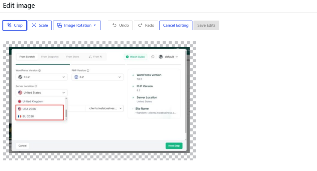
You can crop, rotate, flip and scale the image. To resize it, enter new pixel dimensions under Scale Image and click Scale. Scaling down works well; scaling up is not possible here, and heavy cropping of a small file leaves a soft result.
Resize images before you upload them
The most reliable method is to export the image at 1200 × 630 from your design tool (Photoshop, Figma, Canva or the free Photopea) and upload that.
You control the crop, the original stays on your machine for later edits, and WordPress has less work to do. Exporting as WebP usually cuts the file size well below an equivalent JPEG; see WebP and AVIF in WordPress for the format trade-offs. Keeping the source files organised is part of good long-term content management, because you will need them again when a template changes.
How do developers work with featured image sizes?
Developers usually need two things: the URL of the featured image in a specific size, and a predictable fallback when a post has none.
How do you get the featured image URL in a specific size?
Use get_the_post_thumbnail_url() with a size name. It returns the URL of that registered size, or false when the post has no featured image:
$url = get_the_post_thumbnail_url( get_the_ID(), 'large' );
if ( $url ) {
    echo '<meta property="og:image" content="' . esc_url( $url ) . '">';
}
Pass 'full' for the uploaded (or scaled) original, or your custom size name. This is handy in custom post types, REST responses and headless front ends that need one exact file.
Which plugins help with featured image sizes?
- Regenerate Thumbnails: rebuilds sizes after you change them.
- Dynamic Featured Image: adds more than one featured image to a post.
- Featured Image from URL (FIFU): uses an external image URL as the featured image instead of a Media Library upload.
- An image optimizer such as those in our WordPress image optimization plugins roundup: compresses and converts every generated size.
If you generate featured images in bulk (for example from post titles), see how to automate WordPress featured image creation.
Why is my WordPress featured image too big, blurry or cropped?
Most featured image problems come from a mismatch between the size you upload and the size your theme displays. Here is how to fix the common ones:
When the only image you have is too small, an image upscaler increases its resolution to the size the theme needs without the pixelation that stretching causes, so featured images stay sharp even when the source file was low-res. For slow pages, compress and convert to WebP before or after upload; our guide to image optimization and featured image size goes deeper on file weight.
Can InstaWP optimize featured images automatically?
Yes. On InstaWP’s managed WordPress hosting, the built-in Image Optimizer compresses images and converts them to WebP as they are uploaded, on the Pro plan and above, so you do not need a separate image plugin or API key for it.

- Automatic compression on upload, so featured images stay light without manual exports.
- WebP conversion with edge delivery, alongside InstaCDN, which helps the Largest Contentful Paint image load faster.
- SSH and WP-CLI on every plan, so
wp media regenerateruns from the terminal after you change a size (see developer tools). - Staging on Pro and above, so you can test a new featured image size on a WordPress staging environment and push it live once it looks right.
For a quick experiment, a free WordPress sandbox is enough: install the theme, upload one 1200 × 630 image and check the single post, the blog page and a phone-width preview.
Featured image size checklist for agencies
Upload featured images at 1200 × 630 px (1.91:1) as WebP or JPEG, keep the subject centred, and check which size your theme requests. If the theme crops to 3:2 (Neve, Twenty Twenty-Five), upload 1200 × 800 instead. When you change a size in Settings → Media or with add_image_size(), regenerate thumbnails so older posts match.
For client work, put the size in your build checklist: note the theme’s featured image size, export a template at that size for the client’s team, and confirm the Open Graph image in the SEO plugin. A consistent size across every site you manage means fewer “why is my image cut off” tickets and lighter pages.
Frequently asked questions about WordPress featured image size
What size should a featured image be in WordPress?
Use 1200 × 630 pixels for a standard blog post featured image. It is a 1.91:1 ratio, the shape most social link previews use, and it is wide enough for Google Discover. If your theme crops to 3:2, upload 1200 × 800 instead.
What is the default featured image size in WordPress?
WordPress has no single default featured image size. It creates a 150 × 150 thumbnail, a medium copy up to 300 × 300, a 768-pixel-wide medium-large copy and a large copy up to 1024 × 1024 from every upload, and your theme decides which one to show. If the theme does not set a post thumbnail size, WordPress shows the full image.
Is 1200 × 628 or 1200 × 630 better for a featured image?
Either works. Both are about 1.91:1 and look identical in a theme or a social preview. Meta’s own guidance says 1200 × 630, so use that unless an existing template is built at 1200 × 628.
Why is my WordPress featured image too big?
Usually because the theme loads the full-size image and the upload was a large camera original. Upload a 1200 × 630 image, or set your theme to use the large size, and compress the file to WebP. If the image fills the whole screen, change the theme’s featured image width or use a landscape image.
What aspect ratio should a WordPress featured image be?
Use 1.91:1 (for example 1200 × 630) for social sharing, or match your theme. Twenty Twenty-Five and Neve crop to 3:2, and Google recommends 16:9, 4:3 or 1:1 images for article results.
How do I change the featured image size in WordPress without code?
Go to Settings → Media and change the Thumbnail, Medium or Large size your theme uses, or pick a different image size in your theme’s Customizer (Astra, Blocksy and Neve all offer this). Then run the Regenerate Thumbnails plugin so existing images get the new size.
Does featured image size affect SEO?
Yes, indirectly. A large file slows the Largest Contentful Paint, and Google Discover needs images at least 1,200 pixels wide (with max-image-preview:large) to show large previews. Descriptive alt text and a correct Open Graph image also help how the post appears in search and on social.
What size should WooCommerce product images be?
Upload square images at least 600 × 600 pixels. By default WooCommerce displays the main product image 600 pixels wide, crops catalog images to 300 × 300 and gallery thumbnails to 100 × 100.
How do I set, change or remove a featured image in WordPress?
Open the post in the editor and find the Featured Image panel in the sidebar. Click Set featured image to pick or upload one, click Replace to swap it, or click Remove to take it off the post. The image itself stays in your Media Library.
What happens if a post has no featured image?
WordPress core shows nothing in its place. Some themes and plugins add a fallback, such as a default placeholder image or the first image in the post, and SEO plugins can set a default social sharing image.