If your website has more than a few pages, a traditional dropdown menu can quickly seem limiting. Users hover over a menu item, a narrow list appears, they hover again, another list appears, and by that point they have already lost track of where they were going.
That is exactly the problem a mega menu solves. A mega menu opens a wide, organized panel that shows multiple links, categories, products and even images all at once. Everything a visitor might need is visible the moment they hover. It is why sites like Amazon, eBay and most large news publications use them.
In this tutorial you will learn how to create a mega menu in WordPress step by step, using ElementsKit, an Elementor addon that makes the whole process visual and code free. Whether you are building a WooCommerce store, a blog with many categories, or a business site with deep navigation, this guide has you covered.
Key Takeaways
- WordPress does not support mega menus natively. You need a plugin or custom code, and ElementsKit is the easiest route if you are already building with Elementor.
- You do not need Elementor Pro. The ElementsKit Mega Menu module works on the free version, and the module itself is freemium.
- Turn on the modules first. Enable Header Footer and Mega Menu under ElementsKit > Modules, or the mega menu controls never appear in your menus.
- The “Enable this menu for Megamenu content” checkbox is easy to miss. Skip it and the mega menu settings icon will not show up on your menu items.
- Start from a template. ElementsKit ships ready made mega menu layouts you can insert and customize, so you are not building from a blank canvas every time.
- Turn on Ajax Load for content heavy menus. If the panel holds images or widgets, Ajax Load keeps it off your initial page load.
- Always test on mobile before going live. Check that the hamburger menu opens and the content stacks cleanly on smaller screens.
- Build it on a staging site first. Navigation affects every page, so test the whole setup somewhere safe. InstaWP spins up a staging environment in seconds.
What Is a Mega Menu in WordPress?
A mega menu in WordPress is an expanded navigation menu that displays content in a wide, multi column layout instead of a basic vertical list. When a user hovers over a top level menu item, a large dropdown panel opens showing organized groups of links, headings, images, icons, products or even call to action buttons.
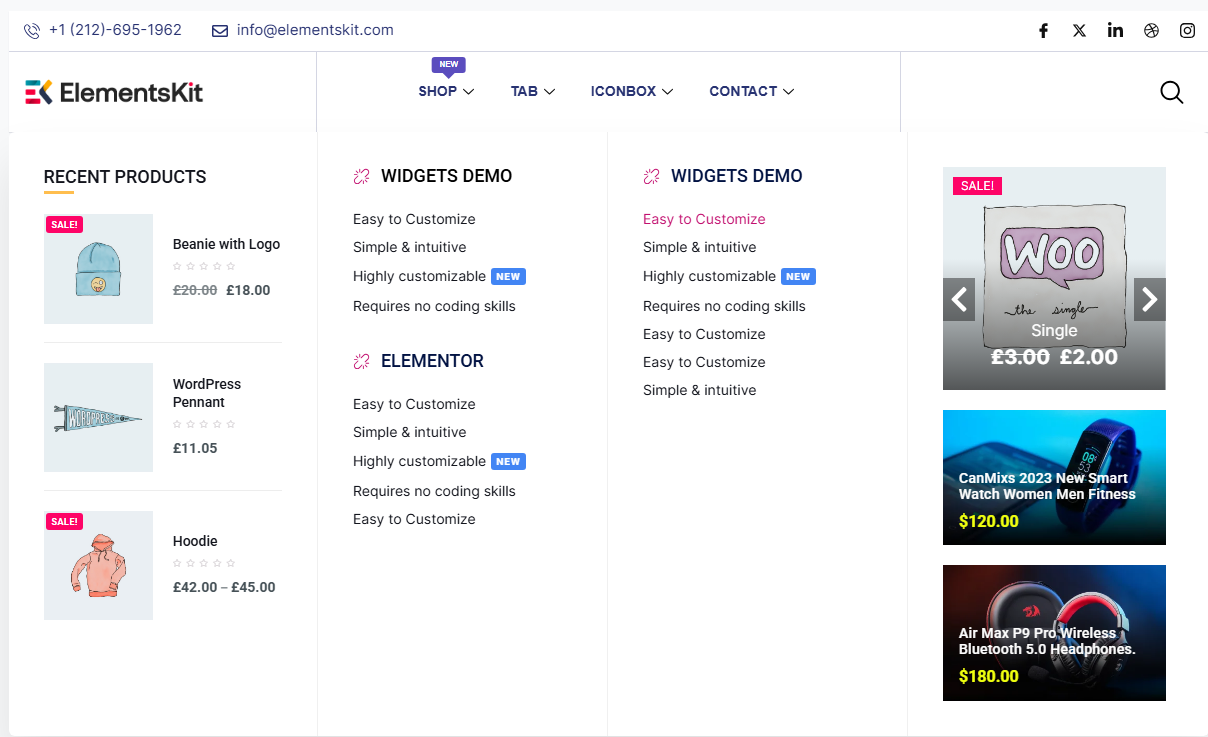
Here is the simplest way to tell a mega menu and a regular dropdown apart. A regular dropdown menu shows you one door at a time. A mega menu opens the entire floor plan at once.
Why mega menus beat regular dropdown menus:
- A regular dropdown shows a simple vertical list, one level at a time. A mega menu shows multiple columns, categories and content in a single panel.
- Regular menus are text only. Mega menus can include images, icons, badges, products and featured links or CTAs.
- Regular menus work fine for small sites. Mega menus are ideal for eCommerce stores, agencies, news sites, or any site with a large content structure.
A quick note on variations: When most people picture a mega menu they think of a horizontal layout, where the panel drops down from the top navigation bar. There is also a vertical mega menu, where the top level items are stacked in a sidebar column and subcategories expand to the right. That works well for category heavy pages or sidebar navigation.
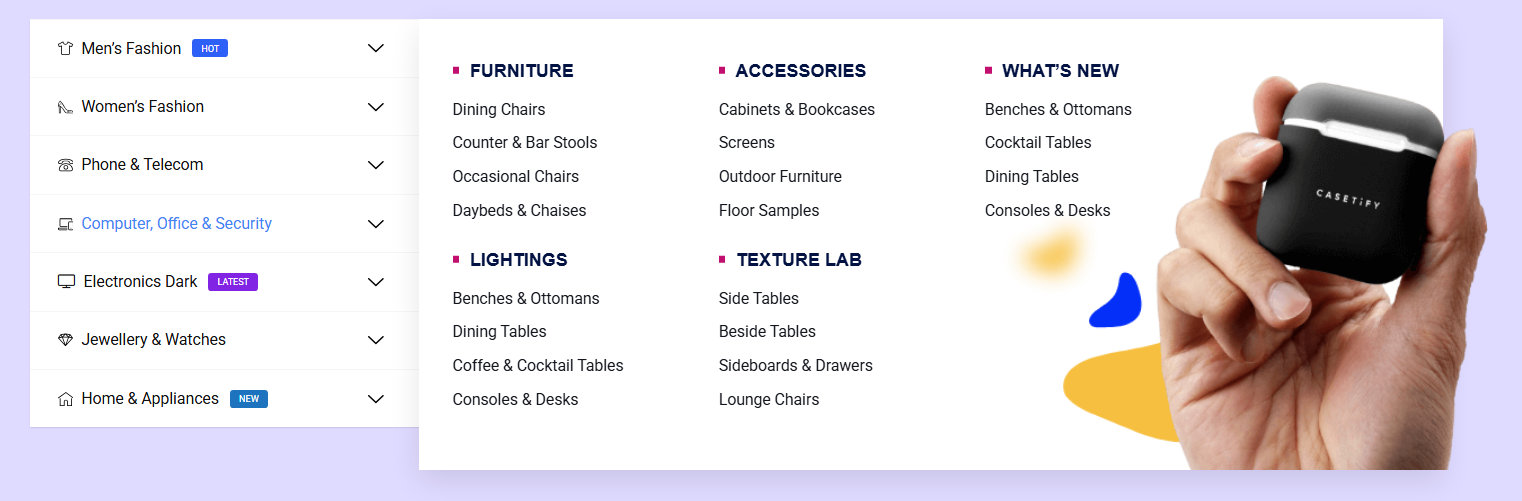
On mobile, mega menus behave differently too. Instead of hovering, the menu collapses into a hamburger icon. Tapping it opens a stacked, scrollable version of the same content. A good mega menu plugin handles this automatically, with no separate mobile setup required.
Why Use ElementsKit to Create a Mega Menu in WordPress?
There are several mega menu plugins available for WordPress, but if you are already building with Elementor then the ElementsKit Elementor addon is the most natural fit. It uses the same editor you already know, so you design your mega menu the way you design your pages, drag and drop, no code required.
Here is why it stands out:
- Works with Elementor free. You do not need Elementor Pro, and the ElementsKit mega menu is a freemium feature.
- Full visual control. Design the layout inside the Elementor editor with columns, images, icons, headings and links.
- Pre built templates. The template library includes ready made mega menu layouts. Pick one, insert it, customize from there.
- Icon and badge support. Add icons next to menu items or highlight links with colored badges, useful for “New” or “Sale” labels.
- Ajax Load option. For content heavy menus, load the panel dynamically so it does not slow down the initial page load.
- Vertical menu widget. If you need sidebar style navigation, there is a dedicated vertical menu widget built in.
How to Create a Mega Menu in WordPress with ElementsKit
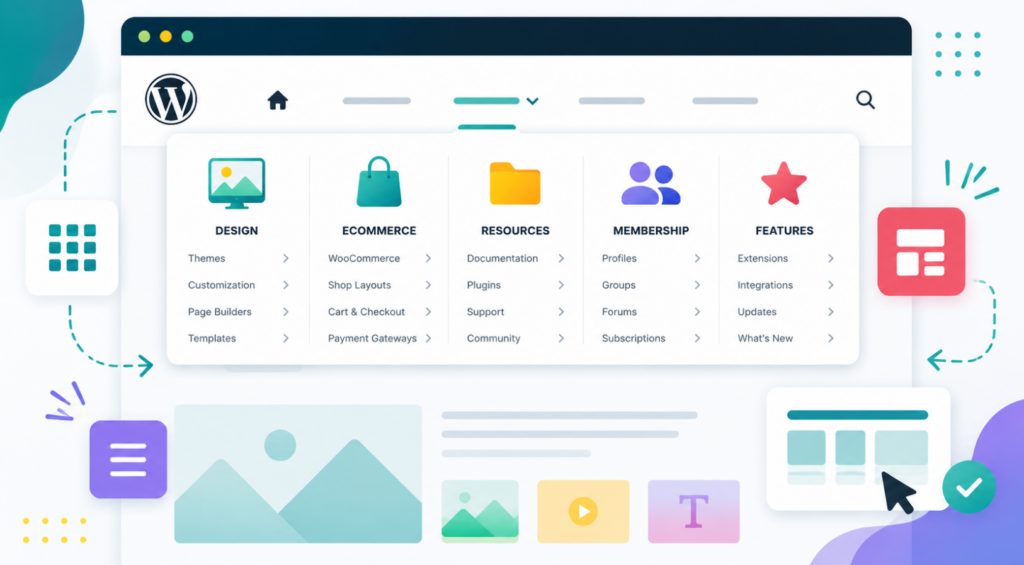
Now to the main part. Following the steps below, you can create a responsive WordPress mega menu for your website. Before you dive in, make sure these two plugins are installed and activated:
- Elementor (the free version is enough)
- ElementsKit Elementor Addon
Step 1: Enable the Mega Menu Module in ElementsKit
The mega menu feature comes as a module, so the first thing to do is turn it on.
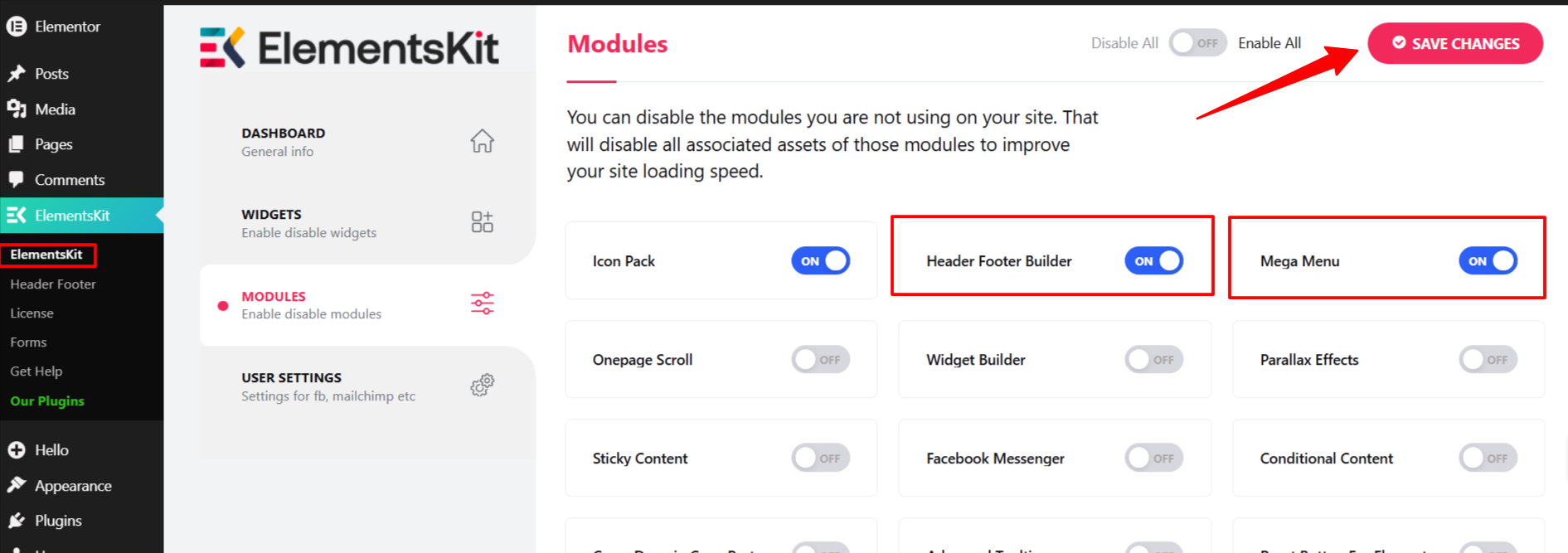
Log in to your WordPress dashboard and go to ElementsKit > Modules. Find Header Footer Builder and Mega Menu in the list, toggle them both ON, and hit Save Changes.
Once these modules are active, ElementsKit adds a mega menu settings icon to each item in your WordPress menu, which is what you will use in the next steps.
Step 2: Set Up Your WordPress Menu
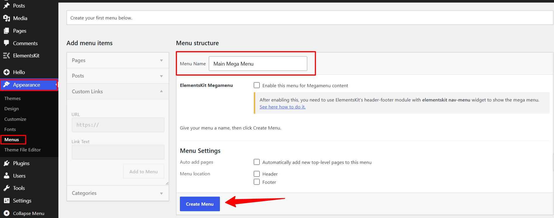
Now you need a WordPress menu to attach the mega menu to. If you already have one, use it. If not, go to Appearance > Menus, enter a Menu Name such as “Main Mega Menu”, and click Create Menu.
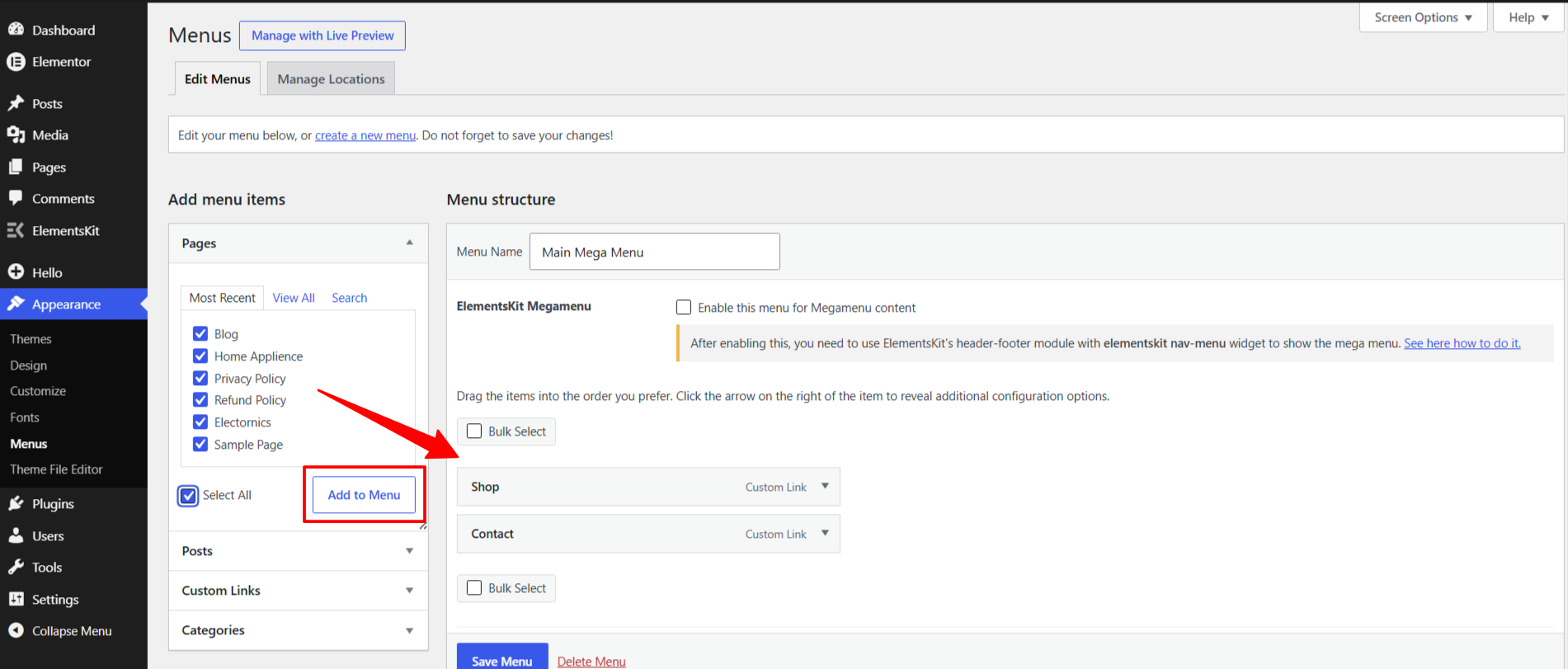
Next, add pages to your menu. On the left panel, expand Pages, check the pages you want to include, and click Add to Menu. You can also add custom links by expanding Custom Links, entering a URL and link text, then clicking Add to Menu. Once your items are in, drag and drop them to arrange the order. Sub items nest under parent items by dragging them slightly to the right.
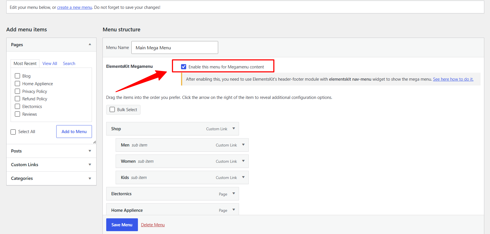
Now the important part. Scroll down on the menu screen and tick the box that says “Enable this menu for Megamenu content.” This is what activates the ElementsKit mega menu controls on your menu items. Click Save Menu when done.
Step 3: Enable Mega Menu on a Specific Menu Item
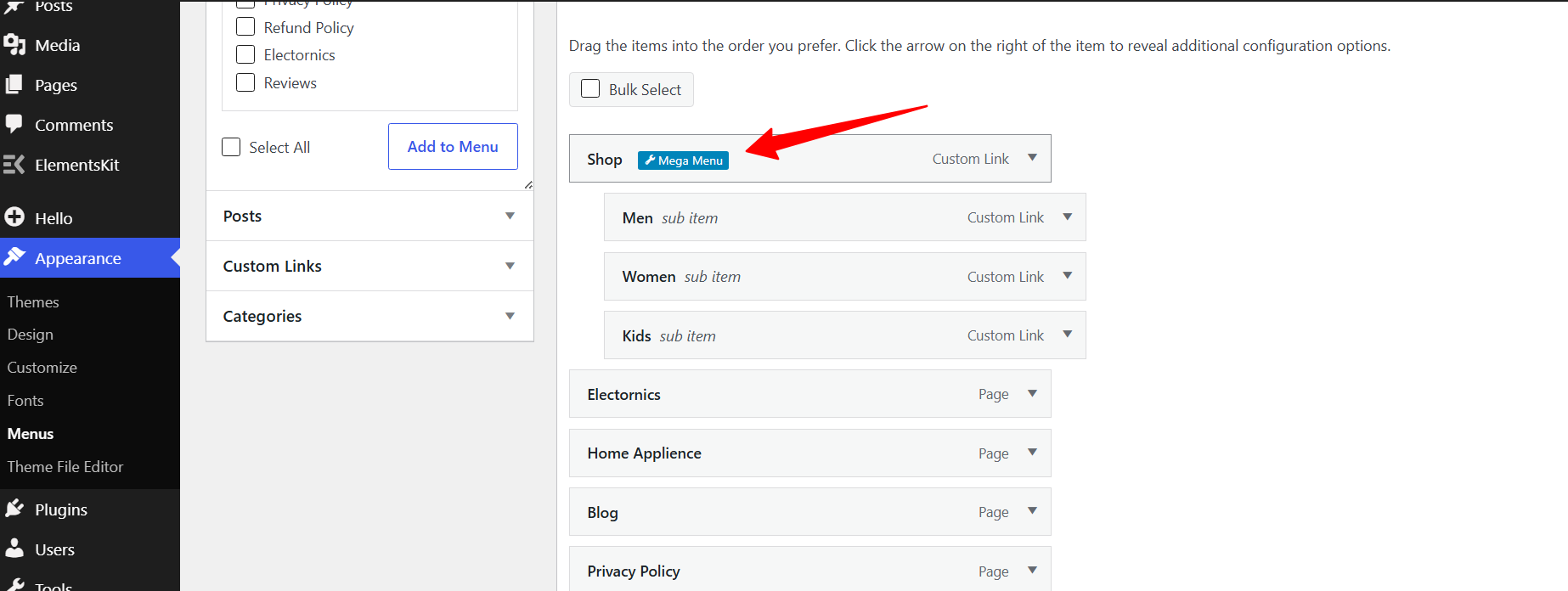
With the menu saved, go back to your menu structure. A small settings icon now appears when you hover over any top level menu item. Click it and a popup opens with the ElementsKit mega menu settings.
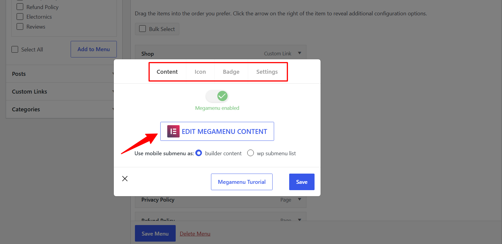
Toggle the Enable Mega Menu switch to ON and click Save. Do this for each top level item where you want a mega menu. You can enable it on all of them or just a few, it is completely up to you.
Step 4: Design Your Mega Menu Content in Elementor
This is where the actual building happens. Click the settings icon again on the menu item you just enabled, then click Edit Megamenu Content.
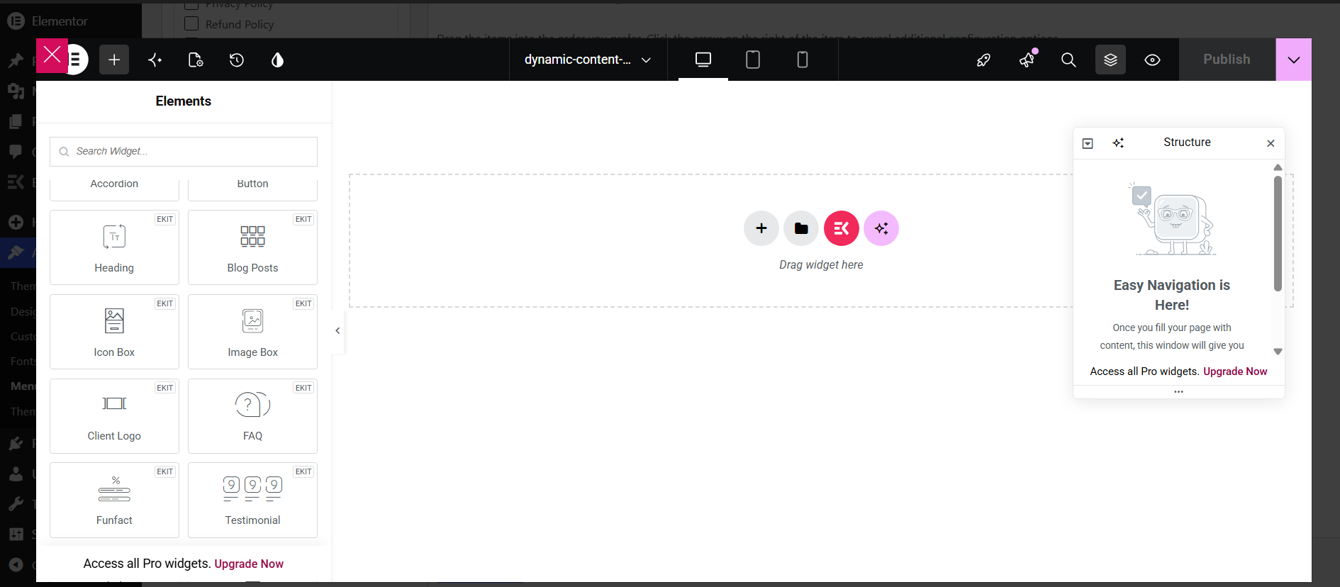
This opens the Elementor editor in a dedicated mega menu canvas. You are now building the dropdown panel, the content users see when they hover over that menu item.
Using a template (recommended for beginners):
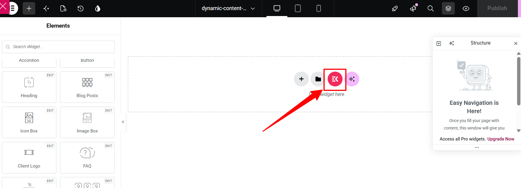
Click the ElementsKit Template Library icon in the Elementor editor. It looks like an “E” with a grid.
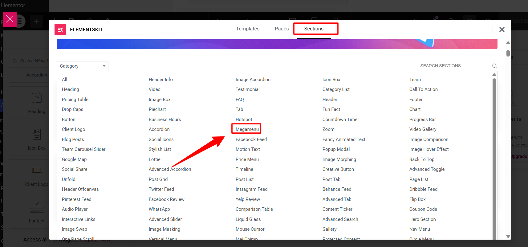
Go to the Sections tab, find Megamenu in the category list, and click it. That reveals all the available mega menu templates. Browse them and click Insert on the one you want.
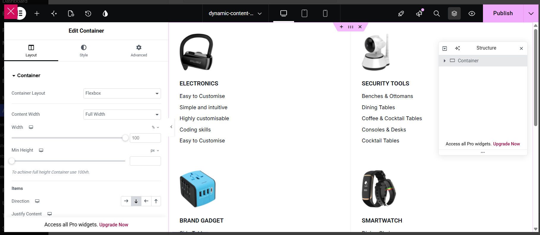
The template loads into your canvas and you can start customizing from there.
Editing the layout:
Click on any section or column to select it. In the left panel, you’ll see layout controls for the container. The most important ones are:
- Content Width (choose Full Width or Boxed depending on your design),
- the direction items flow (row for horizontal, column for vertical), and
- the spacing between elements.
If you need finer control, Justify Content and Align Items let you adjust exactly how items are positioned inside the container. Flexbox is the default layout and works well for most mega menu designs. You can leave it as is unless you have a specific reason to change it.
Editing text and headings:
Click on any heading inside the template to edit it. In the left panel, update the Title text, add a Subtitle if needed, and set an HTML tag like H2 or H3 for better SEO. Switch to the Style tab to adjust color, typography, and spacing to match your site’s design.
Editing the link list items:
Click on any list of links inside the mega menu panel. You can add, edit, or remove individual links, add a sublabel under each link for extra context, and enable a label badge like “New” or “Hot” on specific items. The Style tab gives you control over icon position, text color, typography, and spacing.
When you are happy with the design, click Update to save the mega menu content.
Step 5: Create a Header Template and Go Live
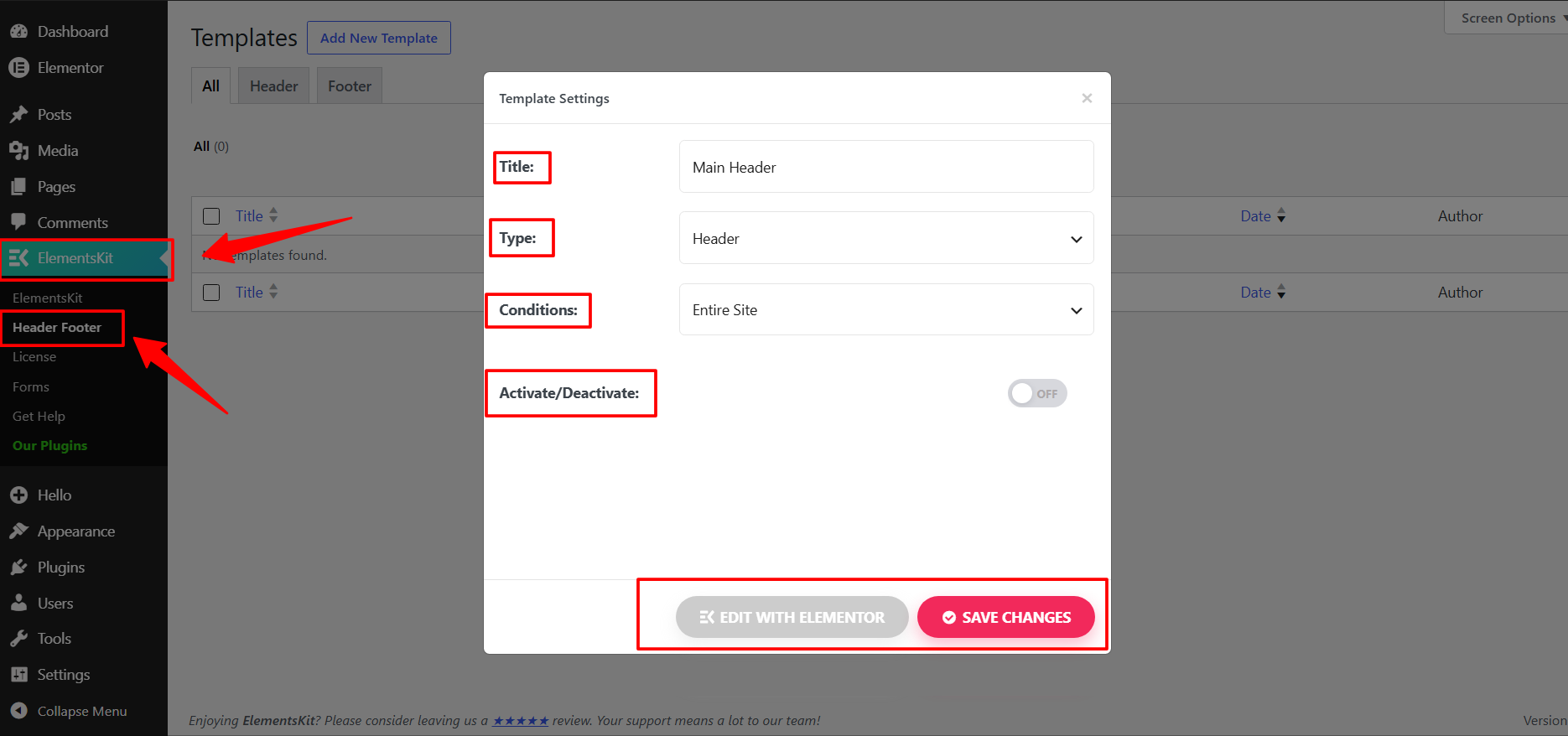
Designing the mega menu content is only half the job. You also need to display it on your site through a header template. Go to ElementsKit > Header Footer. If you already have a header template, open it. If not, click Add New.
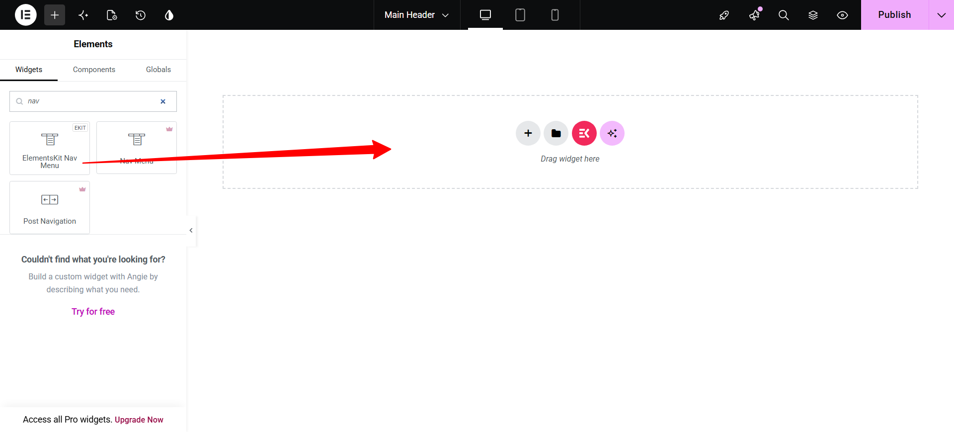
Inside the Elementor editor, add the ElementsKit Nav Menu widget to your header layout and select the menu you configured in Step 2 from the widget’s dropdown settings.
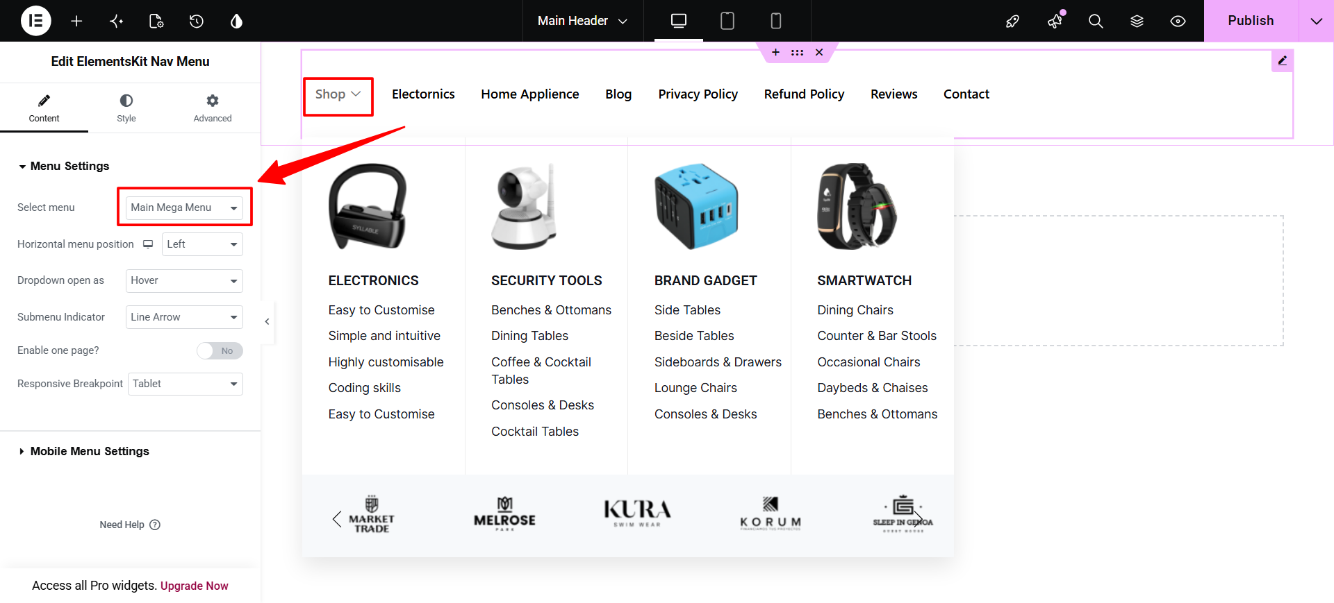
Once your header looks the way you want, click Publish or Update, set the display condition to Entire Website in the ElementsKit settings panel, and save.
Your mega menu is now live. Visit your site’s front end and hover over the menu items to see it in action.
Step 6: Customize Icons, Badges and Width Settings (Optional)
ElementsKit gives you a few extra options for each menu item that are worth knowing about. Go back to Appearance > Menus, hover over a menu item, and click the settings icon.
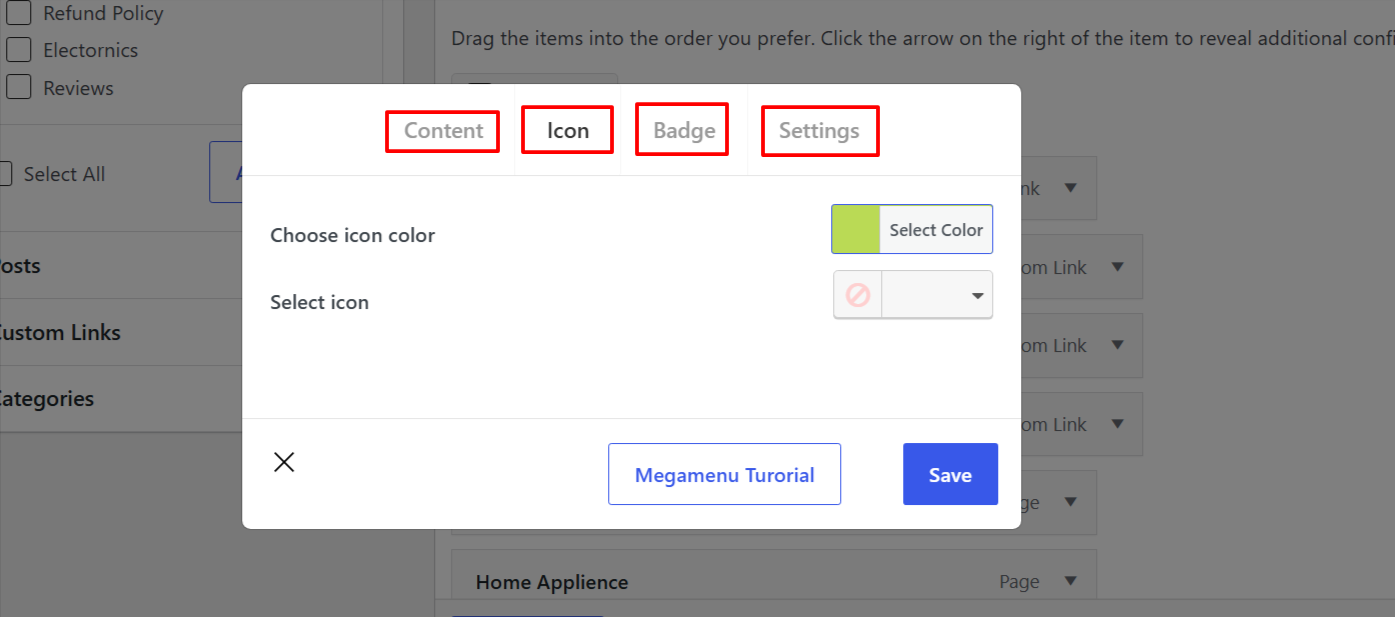
Under the Icon tab, click Select Icon to open the icon library, search for the icon you want and select it. You can also pick a color for it with the color picker.
Under the Badge tab, add a short label such as “New”, “Hot” or “Sale”, set a text color and a background color, and click Save. It is a small touch, but badges draw attention to specific menu items, which is useful for newly added sections or promotional pages.
Under the Settings tab you control how wide the mega menu panel appears. Default Width uses the standard width, Full Width stretches the panel across the entire screen (great for site wide navigation), and Custom Width lets you enter a specific pixel value.
You can also set the Width Position: Default for standard alignment, or Relative if you need the panel to sit relative to its parent element.
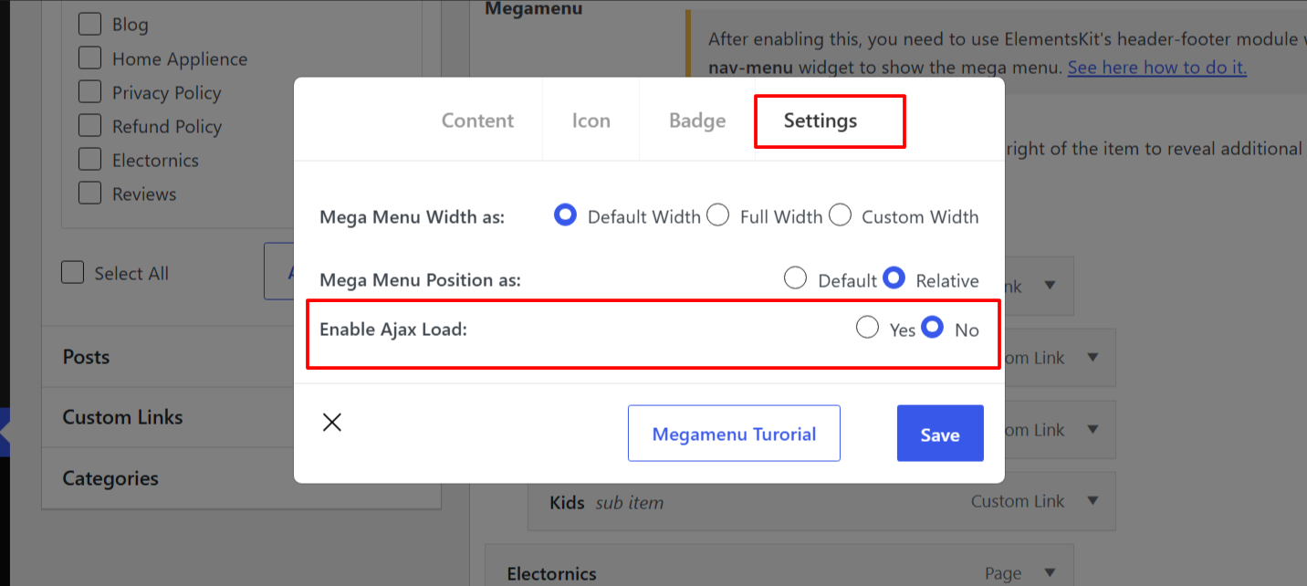
Finally, there is the Enable Ajax Load toggle. Set it to Yes if your mega menu has a lot of content such as images, widgets or dynamic elements. With Ajax Load on, the mega menu content loads on demand rather than with the rest of the page, keeping your initial load time fast.
Preview and Test Your Mega Menu
Before calling it done, spend a few minutes checking how your mega menu actually behaves on the front end. A menu that looks perfect in the editor can behave differently on a live page.
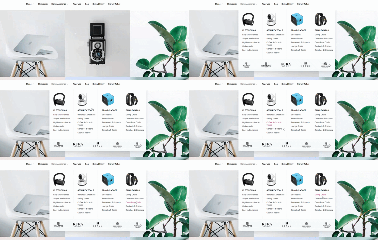
Start by visiting your homepage and hovering over the top level items where you enabled the mega menu. Check that the panel opens correctly, the columns line up, and every link works. Click through a few to make sure they point at the right pages.
Next, check the width. If you set the panel to Full Width, make sure it stretches cleanly across the screen with no overflow or horizontal scroll. If you used Custom Width, confirm it sits where you expect relative to the menu item.
Then resize your browser window or open the site on a phone. The mega menu should collapse into a hamburger icon on smaller screens. Tap it and check that the content stacks cleanly with nothing cut off or overlapping.
Finally, if you enabled Ajax Load, hover over the menu a couple of times and confirm the content loads smoothly with no delay or flicker. On most setups it is nearly instant, but it is worth verifying before going live.
If anything looks off, go back to Appearance > Menus or the Elementor mega menu canvas and adjust. It usually takes one or two tweaks to get everything sitting right.
Tips to Improve Your Navigation with a Mega Menu
Building the mega menu is one thing. Making it genuinely useful for your visitors is another. A few practical tips:
- Do not overcrowd it. A mega menu can technically hold a lot of content, but that does not mean it should. Too many links and columns make it harder to scan, not easier. Stick to the most important sections and keep labels short and clear.
- Use images and icons intentionally. Visual elements help people navigate faster, but only when they add meaning. An icon next to a link category makes it easier to spot. A decorative image that does not relate to the content just takes up space.
- Enable Ajax Load for heavy menus. If the panel holds a lot of images, widgets or dynamic content, turn on Ajax Load in the Settings tab so the content only loads when someone hovers.
- Use Full Width for site wide navigation. If your mega menu spans the entire header, Full Width aligns the panel with the page edges rather than the parent menu item. It looks more polished on wider screens.
- Always test on mobile before going live. ElementsKit handles responsiveness automatically and collapses the menu into a hamburger, but it is still worth checking how your content stacks, especially with multiple columns or images. What looks clean on a desktop can feel cramped on a phone.
- Use a staging site to build and test. Making changes directly on a live site is risky, and a broken menu affects every page. Build and test on a staging environment first, then push it live once everything looks right.
That last point is worth dwelling on. Navigation is the one component that appears on every single page, so a mistake there is never contained to one template. Managed WordPress hosts like InstaWP makes testing easy: you can spin up a staging site in seconds, run the full mega menu setup on it, and only deploy once you are confident.
Wrapping Up
A well built mega menu can genuinely change how visitors experience your site. It removes the guesswork from navigation, surfaces content that would otherwise stay buried, and gives your site a more organized, professional feel, all without a single line of code.
With ElementsKit the process is straightforward. Enable the module, set up your WordPress menu, design the dropdown panel inside Elementor, build it into a header template, and go live. The visual editor handles the heavy lifting, and the customization options give you enough control to make it look exactly the way you want.
Frequently Asked Questions
What is a mega menu in WordPress?
A mega menu in WordPress is an expanded navigation menu that displays content in a wide, multi column layout. Instead of a simple vertical dropdown, it opens a large panel showing organized groups of links, headings, images and icons, all visible at once when a user hovers over a top level menu item.
How do I enable a mega menu in WordPress?
With ElementsKit, enabling a mega menu takes two steps. First, go to ElementsKit > Modules and turn on the Header Footer and Mega Menu modules. Then go to Appearance > Menus, tick “Enable this menu for Megamenu content”, hover over a menu item, and toggle the Mega Menu switch to ON in the settings popup.
How do I edit a mega menu in WordPress?
To edit an existing mega menu, go to Appearance > Menus, hover over the menu item that has mega menu enabled, and click the settings icon. Click Edit Megamenu Content to open the Elementor editor and change the layout, text, images and links.
Can I create a mega menu in WordPress without a plugin?
Technically yes, by writing custom HTML and CSS directly in your theme files. But it requires solid coding knowledge, careful browser testing, and ongoing maintenance every time your theme updates. For most users a plugin is the practical and reliable choice, and the results are far more flexible and visually polished than hand coded solutions.
Do I need Elementor Pro to use ElementsKit’s mega menu?
No. The ElementsKit Mega Menu module works with the free version of Elementor, and you can access the mega menu builder with the free version of ElementsKit. Some customization and dynamic features are limited to the pro version.
What is a vertical mega menu in WordPress?
A vertical mega menu displays the top level menu items in a column layout rather than across the top of the page. When a user hovers or clicks a top level item, subcategories expand to the side. It is useful for category heavy sidebars, dashboard style layouts, or any site that wants a different navigation structure. ElementsKit has a dedicated vertical mega menu widget for this.
How does a mega menu work on mobile?
On mobile the mega menu collapses into a hamburger icon. Tapping it opens a stacked, scrollable version of the same content. ElementsKit handles this automatically, so you do not need to configure a separate mobile menu unless you want to apply custom mobile styles.
Test Your Navigation Before Your Visitors Do
Navigation touches every page on your site, so a broken menu is never a small problem. Build and test your mega menu on a staging site first, then deploy once you are confident it works on desktop and mobile. InstaWP spins up a WordPress staging environment in seconds, and new accounts get 25 dollars in signup credits, so you can build, break and fix things safely before anyone else sees them.